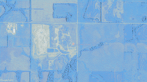
Negative space in graphic design emphasizes visual hierarchy and indicates a visual structure. It is created through silencing of bodies that are considered insignificant and erasure of their marks. Negative space necessitates reduction of contents, and its normative use facilitates segregation.
Negative space in the periphery, between the content and the edge of the page, is referred to as a margin. While contents with more significance are usually placed at the center of a given surface, keeping the margin empty concentrates more attention to the center. Margins also function as borders to differentiate the contents from its irrelevant surroundings. The use of margins in graphic design corresponds to the word marginalization, which is synonymous with social exclusion.
At the same time, by turning attention as a scarce resource, the attention economy emphasizes the corresponding scarcity of surface area that facilitates attention. This resulted in the elimination of margin, a graphical surface densely filled with sensational contents competing over attention, full bleed pages and bezel-less displays.
What could be the strategies of graphical diagramming that decouples negative space with extractivism?

💧Diagramming Porously
💧Diagramming like a Carrier Bag
💧Attention Economy